
In 2005 a team of researchers from MIT and Harvard, Yuri Ostrovsky, Patrick Cavanagh and Pawan Sinha, published a result that surprised many people. Observers were remarkably insensitive to inconsistencies in illumination, both in abstract test images and in altered photographs of real scenes. The visual system, the authors concluded, does not check whether the light across a whole scene agrees with itself.
A decade later, Minghui Tan and colleagues tested the same question on composite outdoor scenes, the kind made by cutting an object from one photo and placing it in another. They found that people can often miss large lighting differences between the inserted object and its new background, which is exactly why digital fakes so often succeed.
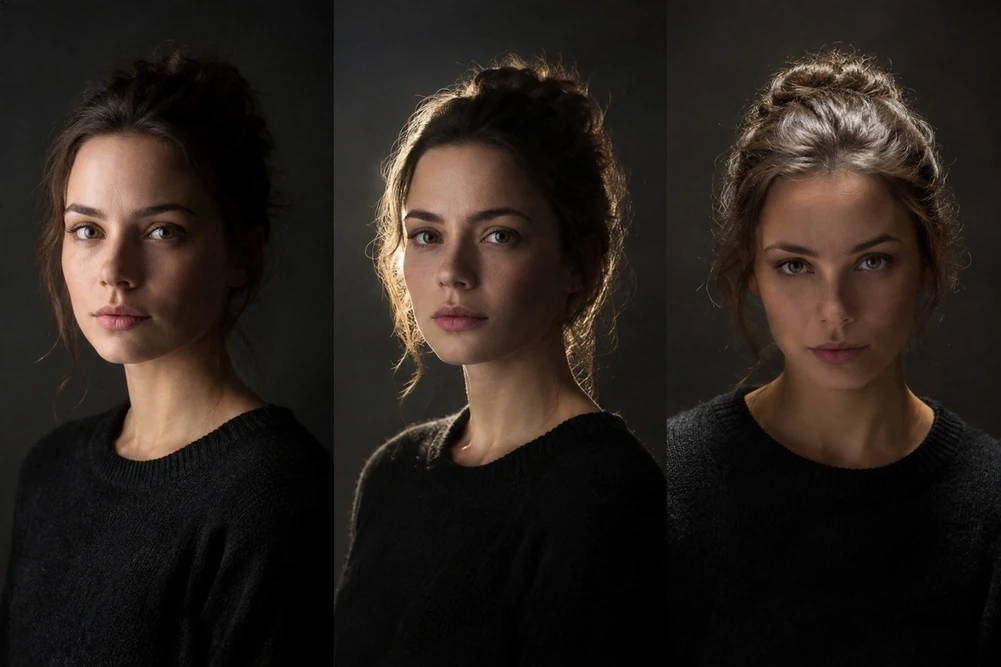
So why not skip the lighting work?
Because not noticing is not the same as not feeling. In my experience, and this is my view from years of location work and retouching, a viewer who cannot name what is wrong will still sense that a picture is off. The mismatch shows up through other cues that the eye reads more readily than a light angle:
- Contact shadows. Where feet, hands or clothing meet the ground, a soft dark line anchors a person to a place. Without it, people appear to hover.
- Edges. A faint bright halo or a too-clean cut around hair gives away that a person came from somewhere else.
- Colour cast. Skin lit by a cool blue sky must carry some of that blue in its shadows; skin lit by low golden sun must be warm on one side and cool on the other.
- Sharpness and grain. If the background has the soft texture of a long lens and the person has phone-camera crispness, the picture reads as two pictures.
What I do with this
The research is a reason to be careful, not a licence to be lazy. Before touching a pixel I decide where the sun is: its height above the horizon, its direction relative to the camera, and how soft or hard the shadows are. Then I relight the person to match, paint the contact shadows and bounce light that the surroundings would produce, and finish by matching colour and grain. Doing this consistently means the picture holds up even for the viewer who looks for a long time, or prints it large.
It also explains why a window-lit source photo is so useful. If light in your photo already comes from one clear direction, I can reinterpret it faithfully. If it comes from everywhere, I have to build direction from scratch. You can read how to take a good one in the source photo checklist.
Sources
- Ostrovsky, Y., Cavanagh, P. and Sinha, P. (2005). Perceiving illumination inconsistencies in scenes. Perception, 34, 1301 to 1314. doi.org/10.1068/p5418
- Tan, M. et al. (2015). The perception of lighting inconsistencies in composite outdoor scenes. ACM Transactions on Applied Perception. doi.org/10.1145/2810038